

You must log in or register to comment.
Just like their CEOs, soulless and bland
I cannot find a Facebook logo like that, and it looks like Balenciaga did the reverse of most, here.
But yeah, in the 2000’s and early 2010’s it was profitable to look radical, now it’s profitable to look professional, so guess what happened? (:
I gotta say I think I thought about this once for just 5 seconds but at the same time I don’t give a fuck. Most of them polute the Earth at extraordinary rates. Doesnt matter what kind of decoration you put on them. I think they’re all pretty gross.
True, true
You don’t have to pay a graphic designer if you just pick a random font.
It always has been.
When one guy in the marketing department only has one job to overthink updating the logo (font) for no reason and nobody notices the change because it’s negligible and that guy keeps receiving the same salary every year no matter what, so it really doesn’t matter.
I don’t recall airbnb & Spotify with those old whimsical logos.
Apparently they had them 2010-2014 and until 2008 respectfully.
Google is the only one who was always just a standard font. Maybe they started that shit?
YvesSaintLaurent is a fucking disappointment. I hate that company, and it was always so recognizable, it was easy to direct my hate. Now - meh.
But as much as I hate the trend - these are only 16 of probably thousands of recognizable brands.
The source for this is actually a good read. Why do AI company logos look like buttholes?
Remember when we used to worry about paper weight and surface for our CVs?
[Faye Dunaway, screaming] NO SERIFS EVAAARRRR!!!
This is what happens when you sell your soul
Fitting logo, if they sold mid-range kitchen appliances…
No no you misunderstood the rebrand. Now they do high-end appliances!
Could have called this the moment they started selling diesels and estates (station wagons to the Americans) … that was the start of dilusion of the brand.
Edit: In other news, how about that Lotus / Lamborghini / Aston Martin mid size sport SUV? Pretty neat for taking your kids to school, wouldn’t you say?
Didn’t Lamborghini start out making tractors?
They still do, beautfil utilitarian tractors … none of this SUV shite.
corny ass new logo
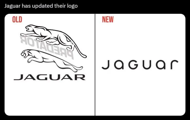
You have one of the coolest, most recognizable logos there is, and you do this.
Oh, that is an awful font. The G absolutely does not fit with the rest of them.
What kind of idiot writes this as JaGUar? And everyone was ok with this decision?
They destroyed one of the most iconic logos!
I hate this. And presumably this is happening because some sort of market research consumer psychology findings show this is preferable and leads to more sales. Which somehow makes me hate it even more.
Roll three D6’s, scroll down to see what font to use, type out company name, make 50 dolla.
Cra, bankrupted the company because we rolled Natural 1s…Wingdings.
The absolute worst one is Kia’s new logo. However they have managed to go in the opposite direction and make the logo even less clear than it already was.
I’d argue that the HP stripe logo is just as bad:
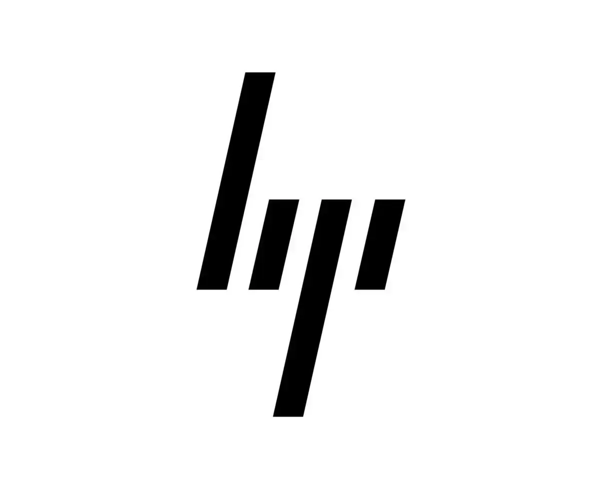
The KIA logo always reads as “KN” to me, but at least I can fucking read it. The first time I saw the new HP logo I legitimately didn’t know what I was looking at. lip? lili? lqi? lgi? I basically always end up reading it as “lip” instead of “hp”.
MIT did it correctly, and a long time ago.

Though they redefined the colors to only be monochromatic, no more gray i
The new Kia logo looks like they slanted the nine inch nails logo and called it a day.
I drive a 2017 Kia Soul EV and it still has the old logo and I love it. I love that it is a boring, no-nonsense logo. Just straightforward. KIA. No pretense.
Now it’s КИ (sorry if Cyrillic doesn’t show up on your device)
I always read them as KN.
Probably the worst logo in the industry.
Isn’t that their old logo too? I dont know why they changed from the recent logo. Their current (and possibly old) logo just screams “cheap car” to me.
You mean that new car market no one has ever heard of, KN?
Ya, Kia Notors


