I simply picked the highest group from every category.
You’re comparing percentages, not actual numbers. A higher percentage of high earners said the US was on top but there are a lot more people who fall into the <$50k category than who fall into the >$100k one.
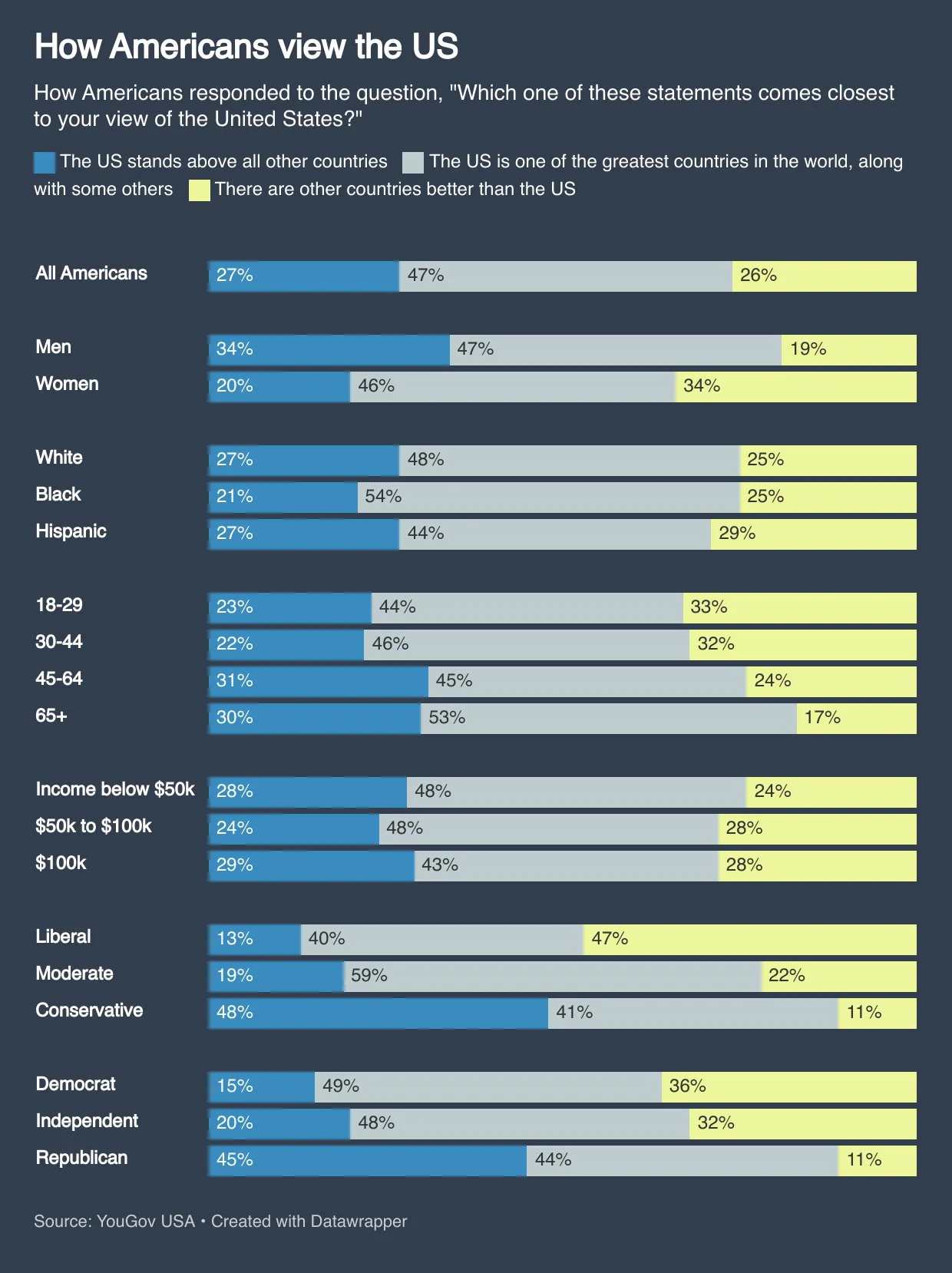
28% of those said the US is the best. That’s 27, 487,258 people.
Now we need to do some math to find earners over $100,000 but it works out to 25,227,310.
29% of those said the US is the best. That’s 7,315,919 people.
27.5 million people vs 7.3 million. There are 4 times as many poor people who believe the US is the best country in the world as there are top earners.
Check out the difference between the group of blue vs yellow: <$50k has 4% more people who think US is the best vs people who think that other countries are better.
$100k has 1% more people who think that the US is the best place vs the opposite.
That means, in total, the group of <$50k is more pro-US-superiority than the group of $100k.
That is data from the chart, nothing else.
pointed out to you that simply using extrapolation, there is a trend
Where is there a trend? There is no trend of the pro US side, there is a trend on the anti US side. And that trend on the anti US side is the opposite of what you are saying.
Three data points is by far too little to extrapolate anything at all.

deleted by creator
You’re comparing percentages, not actual numbers. A higher percentage of high earners said the US was on top but there are a lot more people who fall into the <$50k category than who fall into the >$100k one.
Using the Social Security numbers from 2023 (the latest available) there are 98,168,780 who earned less than $50,000 that year.
28% of those said the US is the best. That’s 27, 487,258 people.
Now we need to do some math to find earners over $100,000 but it works out to 25,227,310.
29% of those said the US is the best. That’s 7,315,919 people.
27.5 million people vs 7.3 million. There are 4 times as many poor people who believe the US is the best country in the world as there are top earners.
Check out the difference between the group of blue vs yellow: <$50k has 4% more people who think US is the best vs people who think that other countries are better.
$100k has 1% more people who think that the US is the best place vs the opposite.
That means, in total, the group of <$50k is more pro-US-superiority than the group of $100k.
That is data from the chart, nothing else.
Where is there a trend? There is no trend of the pro US side, there is a trend on the anti US side. And that trend on the anti US side is the opposite of what you are saying.
Three data points is by far too little to extrapolate anything at all.
deleted by creator